Graphic design and branding for an author and speaker's book proposal
Keith had already spent years developing the content for his new book—now that it was ready to be sent to publishers, it's time to set up a brand kit to visually represent the content and make the proposal
that much more effective!
Step 1: Research the Existing Brand Identity
Because Keith had been teaching and living the content of his new book for years, there is already a "brand" that exists: Keith himself! As a leader, preacher, teacher and coach, Keith has a strong identity with the people who already know him. It's my job to capture that and leverage it to help communicate who he is, and why his book will be worth publishing and distributing.
I created a
Brand Discovery Quiz
that leads my clients through some questions that help us identify the positioning, tone, language, colors, fonts, and more that will help establish the visual identity and messaging for the brand.
Taking my clients through the Brand Discovery Quiz is one of my favorite parts of this whole process. Not only does it challenge the way they've thought about communicating their work in the past, it also starts to help educate them about the ways different fonts, colors, and words communicate on a subconscious level. Some people may find the quiz a little more challenging than they expected, which is why I give them plenty of time to take the quiz before we move forward on the work.
Step 2: Mini Style Guide
After Keith completed the quiz, I took his answers and created a custom
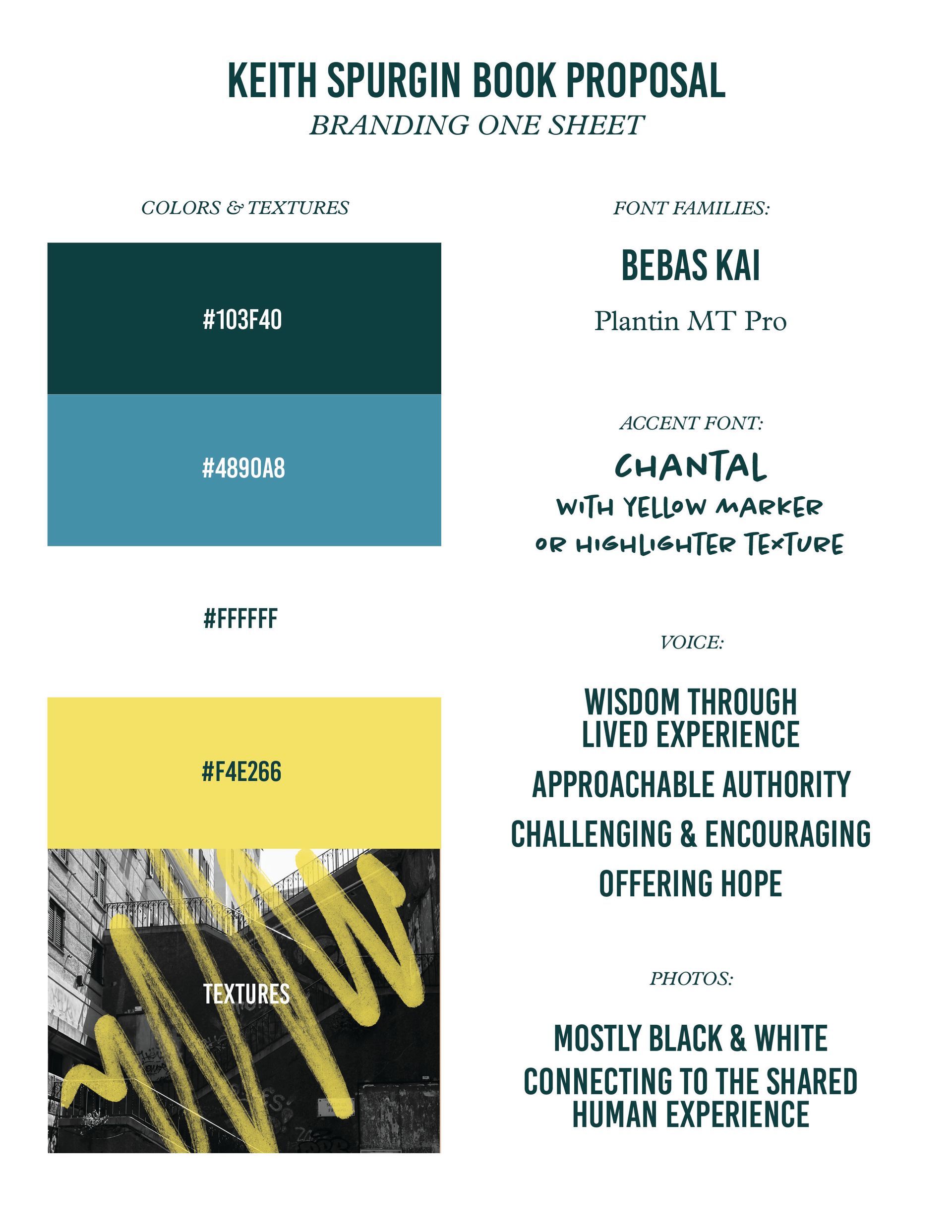
Mini Style Guide: a one-page document that establishes the colors, fonts, brand voice, and even photography and textures!
I knew Keith wanted a fairly toned-down and professional color palette that looked kinda sleek but still approachable. I gave him simple-but-upscale fonts for his main titles and copy typography, but wanted to add an accent that would add some "passionate teacher" vibes. That's where the handwritten style font and yellow highlighter/marker texture came from! These added touches brought another layer of energy and authority, while keeping some fun in the mix.
Side note...
It's key to point out here that determining the "Voice" of the brand is just as important to this process as anything else; in fact, nailing the voice and positioning is a key part of picking out the fonts, colors, and visuals to begin with! People may think that the branding process is as simple as choosing a cute color palette or the most trendy fonts, but the best brands start a lot deeper, require time, research, and even basic understanding of psychology and marketing/communication to be as effective as possible. Without intentional goals, and a "why" behind each branding choice, a brand kit would just be a collection of hex codes and random vector files. But maybe that's a longer conversation for another day!
Step 3: Feedback + Collaboration
I know I said the quiz was my favorite, but I think getting to hear from my clients after I send them the first iteration of the new brand might be the best part... Since the quiz led them to think through the brand positioning established by the visuals and terminology, my clients get to tell me if I interpreted the results of the quiz effectively. This is where their personal preferences, personality, and ideas really get to shift this project into a collaborative space.
Keith and I emailed back and forth about what it would really look like to implement this style guide into the book proposal document. Once I sent him the cover and next few pages of the new branded proposal, he was all in!
Step 4: Implementation: Layout + Design
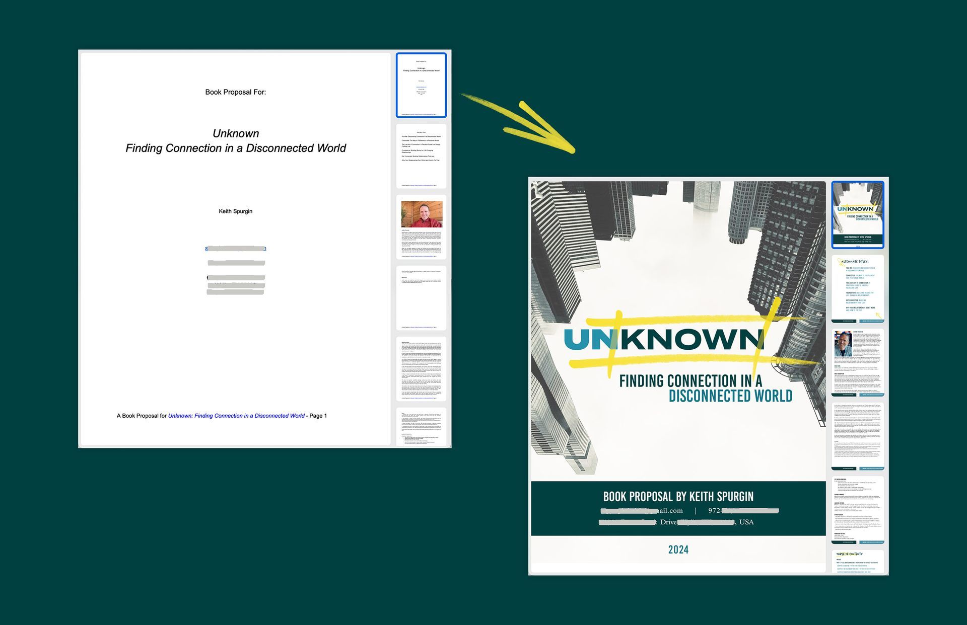
With Keith's green light for the fresh brand's style guide, I was able to hit the ground running. In the next day or two, I had turned a basic Google Doc into a cohesive and impactful visual PDF that captured the energy, authority, and relational genius that Keith radiates in person.
Once we had the basics of the new layout with the fresh branding incorporated, we were able to get into the nitty gritty. We shared a few back and forth emails with requested updates: adding an additional chapter of the book to the preview, including a new marketing opportunity that spread the reach to a national radio show, exporting an interactive PDF version so he could copy and paste the text, etc.
It's always important to me that my clients get a transparent and collaborative experience as we work together on their project, so including time for revisions is a given with every design project.
Final Step: Designed Deliverables
At the end of the project, I delivered a few different files to Keith: a high-res PDF file ready for printing in CMYK, a digital "interactive" PDF file that allowed him to copy and paste text from the proposal for any communications needs, a JPG of the cover design so he could easily share and talk about the project with his community, and the Mini Style Guide.
If you're interested in getting a fresh brand done for your project or business, I'd love to hear from you!
Contact me today to get started.
